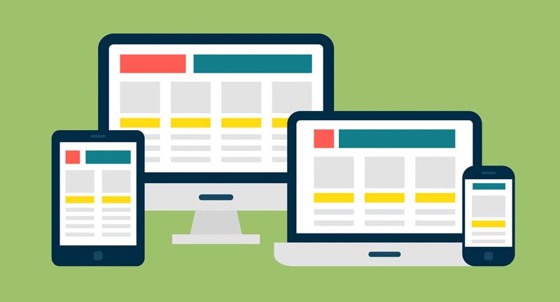
A responsive design means a website that has been created so that all of the structure, images, and content of the site remain the same on any device.
For example, when a user accesses a website on their desktop, they are getting the full view of the website. But when the same user goes to visit the website from their smartphone or tablet, the site will pull in to fit on the smaller screen.
With mobile responsive website design, you don’t have to worry about having various websites for various devices or ensuring that your site operates properly on a mobile device.
Benefits of Responsive Web Design:
As many people are starting to use mobile, like tablets and smartphones for every business project only capable of desktop, one thing has become clear: Mobile is taking over internet surfing.
It’s everything from using apps, browsing social media, checking emails and doing online shopping. Your business websites must be now mobile friendly and web responsive.
Responsive web design benefits designers, developers, business and most importantly, users in the following ways:
1. Increase in mobile traffic
According to the survey, half of the traffic to peak sites in Kathmandu, Nepal came from mobile devices in 2019-2020.
Therefore, it’s progressively essential for companies to have sites that contribute adequately to smaller screens so that users don’t experience wrap pictures or encounter a sub-optimal website design.
While some businesses still select to have a different type of their site for mobile users, responsive web design is becoming standard because it provides incredible flexibility at lower development price.
2. Easier maintenance
Your web developer team or staff have to divide resources and time into maintaining two websites.
Responsive design’s “one size fits all” perspective means less ache for web developers, business owners, and consumers.
With responsive web design, your web designer will spend less time on managing works and focus on more critical tasks such as marketing and content creation.
3. Upgrade user experience
The main point is showing the quality of users’ experience the time they expend on your website. If they find it tough to negotiate or use because they’re forced to pinch and zoom continuously, they won’t stay on your site.
But if your website responds to the change in screen size, then the audience won’t have issues accessing links, menus, buttons or filling out forms. As an answer, your user experience will be useful, and they’ll spend more time on your site.
4. A more straightforward website is problem-solving.
With a responsive website, your website figure is clarified as you’re staying on top os a single set of statistics.
You can even now get an understanding of which devices and browsers your visitors are using, where they drop off, and how long they expend on your website, but you won’t want to read data from multiple reports to get an actual image.
5. Quicker website development
However, developing a mobile version of the website of your site takes up more time than developing a responsive website that looks amazing and works as planned doesn’t matter which device consumers are using.
Another disadvantage of a mob;e site version is the fact they are expensive because your developer has to make two websites instead of one.
6. No duplicate content punishment
While search engines are getting sharp day by day, they still need to understand which website design is more used by the consumer and essential. If you’re using the mobile version of your site, your content remains the same even if the URL is different.
These can cause both designs of your website to have a lower search engine rank because search engines won’t know which content is appliable. A responsive website can remove all of the headaches if you had any hesitation about sensitive web design importance; this should help reduce them.
7. Better SEO
Another benefit of responsive web design is upgraded search engine rank. The responsive web version is becoming as crucial to SEO(Search Engine Optimization) as quality content.
Well built backlinks and better bounce rates translate into higher search rankings, but there’s an additional SEO advantage for mobile-optimized websites.
8. Well website loading times
Websites that are responsive lean to lead quicker on all devices, but especially on smartphones and tablets.
Thanks to responsive fluid grids and images, it takes remarkably less time for the page to load, which won’t bother your visitors and make them stay longer on your site. These explain the necessity of responsive web design.
9. Lower bounce rates
Bounce amount marks the percentage of visitors to a particular website who cross away from the site after seeing a single page only.
As I’ve explained above, a responsive website means visitors will stay on your site longer, which decreases your bounce rates.
Consumers will be more likely to click and read other pages on your website and examine everything you’ve got to offer.
10. Higher reformation rates
Lower bounce rate and spending more time on your site are proper first steps to upgrading your visitors’ experience and creating trust.
That upgraded user experience and trust guide to better transformation rates, whether transformation means signing up for your newsletter, make a purchase or booking a call.
Consider for a move than usual smartphone reformation rates are up by 60 percent compared to desktop and it’s easy to see why a responsive website is a must.
11. Better backlinks
It’s worth state that a responsive website can help you when it comes to creating backlinks. Backlinks play an essential role in any SEO scheme because they show search engines that other websites consider your website a well-known source of information.
If your site isn’t responsive, other sites will be less willing to link to you. After all, linking to a website that doesn’t give good user experience makes them look bas as well.
12. More social sharing
When done rightly, responsive web design can enhance social shares for your content. There is another one of the responsive webs design advantages.
Responsive content match with responsive social media buttons make it easy to share links to your site’s pages even o smaller screens. These can help enhance your credibility and expose you to a new consumer, which leads to more conversion and more traffic.
Improve your website by applying Responsive Web Design
As you can read here, there are massive responsive web design advantages for your business. If your website isn’t yet responsive, planning for would-be beneficial to your business. It will help you to decide which page components are essential, which site can be dive into choosing the correct place and the right template or theme for your website. You can hire a web developer to get these benefits on your website and increase your sales.